Interview by Amber Thompson, Marketing & Communications Coordinator
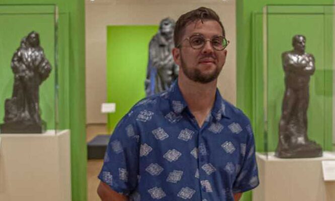
Have you ever wondered what it takes to design an art exhibition? Meet Randall Barnes, OKCMOA’s installation and design manager and one of the creative minds behind the Museum’s exhibitions. Randall graduated from Oklahoma State University with a BFA in studio art. He has worked at the Oklahoma City Museum of Art since 2015 when he was hired as a preparator, before being promoted to his current role in November 2022.
Did you always want to work at a museum?
No, I didn’t. My last year at OSU I found out about museum work. They were opening a new art museum on campus. I got a paid internship cataloguing and moving stuff from the old museum to the new one, the Postal Plaza Gallery. After working in it, I thought “I can do this and work on other projects.”
What kind of research did you do for the True Nature exhibition?
I watched a lot of documentaries and YouTube videos about Rodin. Most of those were more institutional and just about Rodin’s life. One of the things we talked about early on, though, was how Rodin’s work was presented at the World’s Fair. There was this new thing people were moving toward called the white cube gallery. It’s a gallery style where the art isn’t informed by anything external, just white walls. Rodin was embracing a trend that was cutting edge. I’m not going to say that Rodin would have liked these colors necessarily, but I guess that’s how as a designer I sometimes look at art.
The colors in True Nature are very eye-catching. Why was it important to you to use color this way? What about this exhibition is different from how Rodin has been presented in the past?
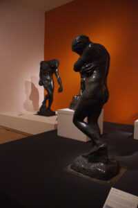
There’s a lot of energy around the exhibition, and that sort of fueled a lot of the color. There’s been a more neutral approach to Rodin exhibitions in the past. I wanted to embrace color inspired by the Impressionists with a 2023 fashion to it. You could say that while his work has been presented more traditionally in the past, this is more untraditional.
Is good design something people don’t notice? Is it mainly in aid of the art and the experience or do you see those things as separate?
Design should always be in aid of the art and the experience. Those who notice the design will notice it. Sometimes that’s people paying really close attention, and sometimes that’s people who come here a lot, who think, “Oh, this is different.” I’m always trying to incorporate placemaking, too, so that it feels like more than an art gallery.
What do you mean by placemaking?
Placemaking is like a skating rink. It’s about life and culture—the specific culture of a place. A skating rink, you have people of all ages. It’s where middle school kids go to hang out. Maybe if you’ve been going for 20 years, you do disco nights; maybe you’re just there for a birthday party. It’s about making a place where community and culture take place, where people are experiencing life together.
What besides your design contributes to placemaking for this exhibition?
I think the tactile features, as well as a lot of the programming the Museum is doing.
Beyond the inclusion of a touchable object, QR codes, large print labels, and cane paths, are there other ways this exhibition has been designed with accessibility and inclusion in mind?
With the use of color to make the spaces more attractive, less sterile, I think that’s a way to make it feel more inclusive. People want to come here and be mesmerized and wowed. We have these grand spaces, 15-foot walls. There’s a lot of opportunity for that. The inclusion of Spanish labels at the front is awesome. There’s also something about the way other cultures use really vibrant color. We have to ask, “Who are we designing these spaces for?”
Who are you designing for?
This was about trying to make Rodin for an audience in 2023. I think everyone can find something cool here. I didn’t want the tropes of the art world to be so heavy-handed. I want my friends who aren’t into art to want to come here.
What were some of the challenges of the installation?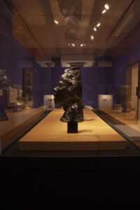
As far as challenges go, there are a lot of pedestals in the first gallery. I think of it as an immersive Rodin experience. You have this space of Rodin’s work and his predecessors’ work and his contemporaries’ work, so wherever people turn, there’s something else. So, I have to ask, how much space is there? How much is eight feet with these objects in place? Will people be comfortable?
The 3-D software program Ortelia helped a lot. I can look at the same gallery with 100 colors. It takes some of the guesswork out of it: how will these colors look together? Do they neutralize each other? Not so much guesswork, really, but being able to see an entire gallery that way is very helpful. Like the Process Space orange. I first drew that from the brick in the Burghers of Calais image, whereas in the past the gallery color might have been picked first without thinking about the brick. Having it paired with that dark green in Burghers makes a lot of sense, but it also helps because I was able to see that the orange would work for Gates of Hell too. That way when people see the orange in the Process Space, they’re not thinking, “Where did this come from?”
Is that something that you credit to the software you’re using or to the things you prioritize?
I think it’s informed by both. I’m going to notice it, but the software helps me make those decisions too.
I also deal with some imposter syndrome, but I know that the experiences I’ve had can inform my decisions. Burghers was difficult because when we got them in there, I started second guessing myself: maybe we should try it this way, or like this. But I’d tried it in the program all these different ways already, and none of them worked. Only the one we’d decided on was going to work. I feel like I can trust myself. I was glad to have Burghers as a model for that.
What do you hope people get from this experience?
I think just a good time with their friends and family, just enjoying themselves. Maybe something stops them, catches their eye. That’s maybe color or the sightlines, like a preview of what’s ahead, a glimpse of the next gallery. Maybe something reminds them of a story they share with someone they’re with.
